UX problem:
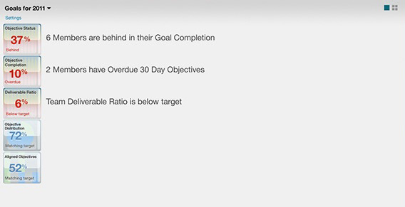
Users don’t know what to look for in the Human Capital Management Analytics tool they use. “You have to be an expert first, in order to make sense of the data.”
How did we solve it:
Wouldn’t it just be better if the data would tell the user what is going on rather than them having to understand what to look for and how to interpret it?
What if?
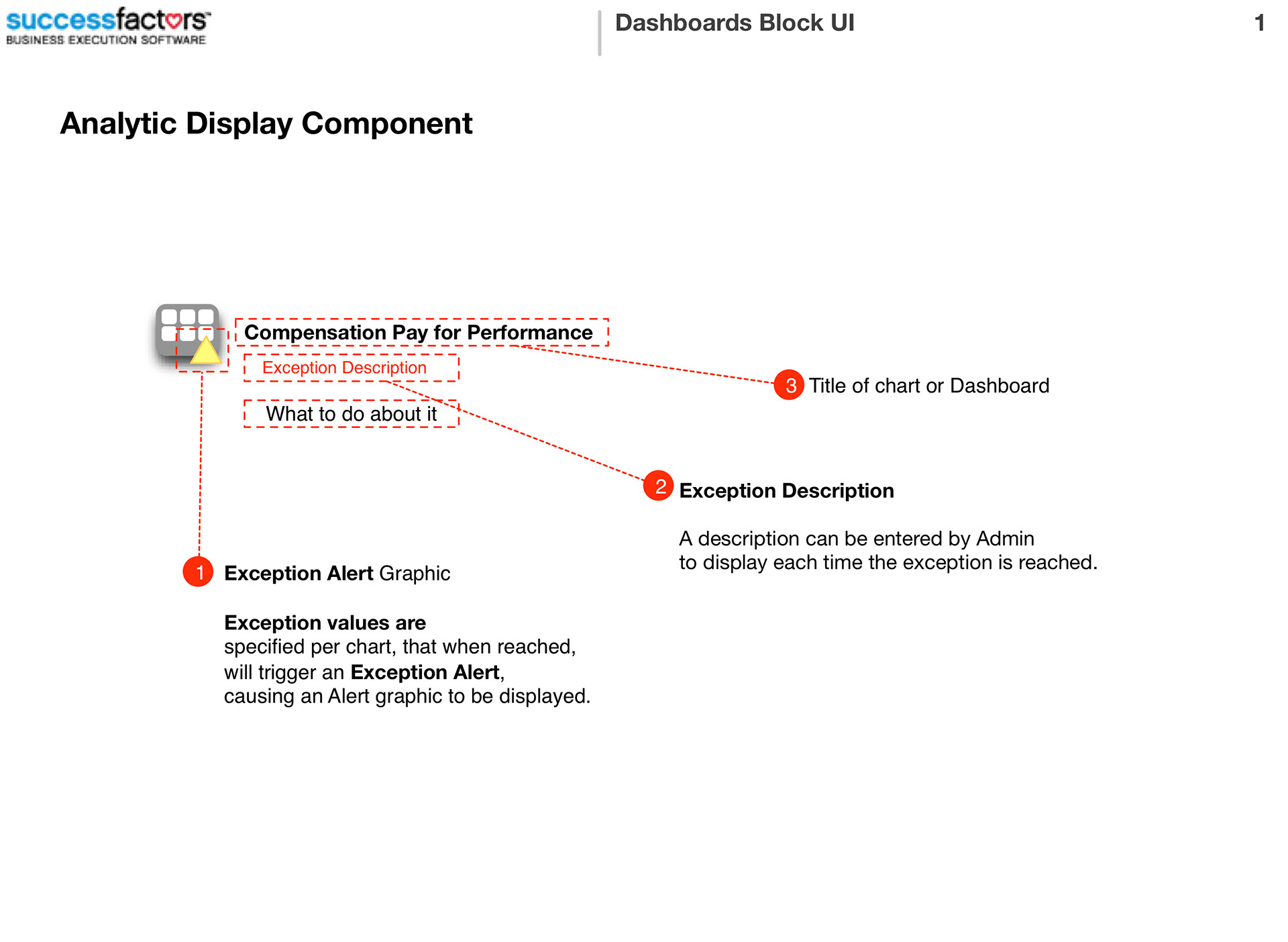
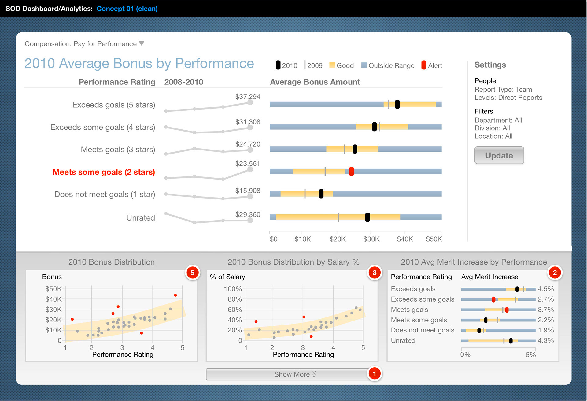
…we could set exception values to thresholds in the data that would trigger, editable, publishable messages that were meaningful in human terms? Then, when critical thresholds are reached, a simple explanation is delivered that anyone can understand.
What did we do?
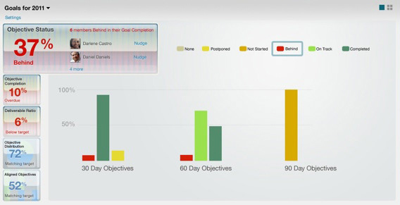
We decided to address the data by creating an administrator tool that would allow thresholds to be marked, and system messages published.
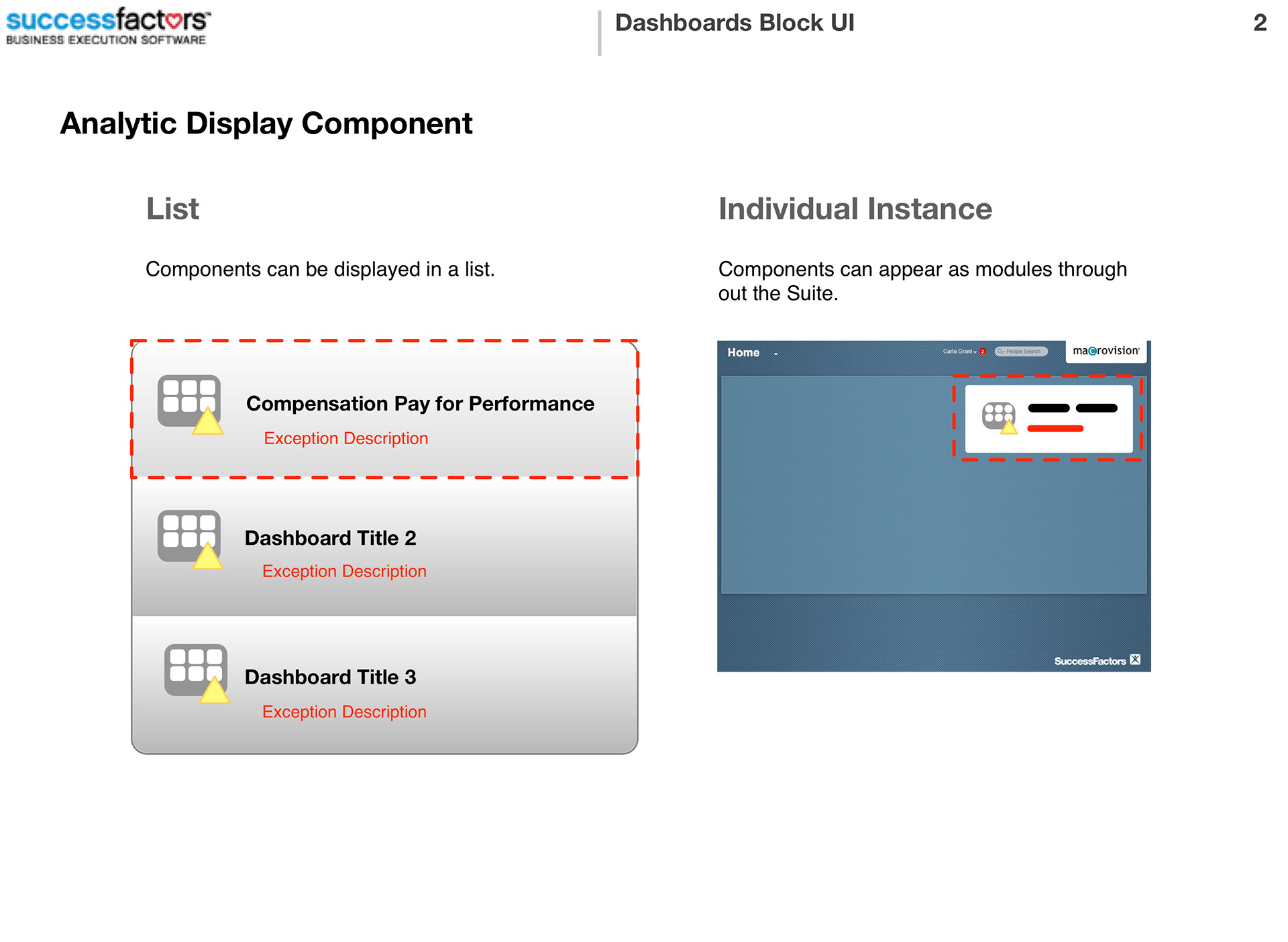
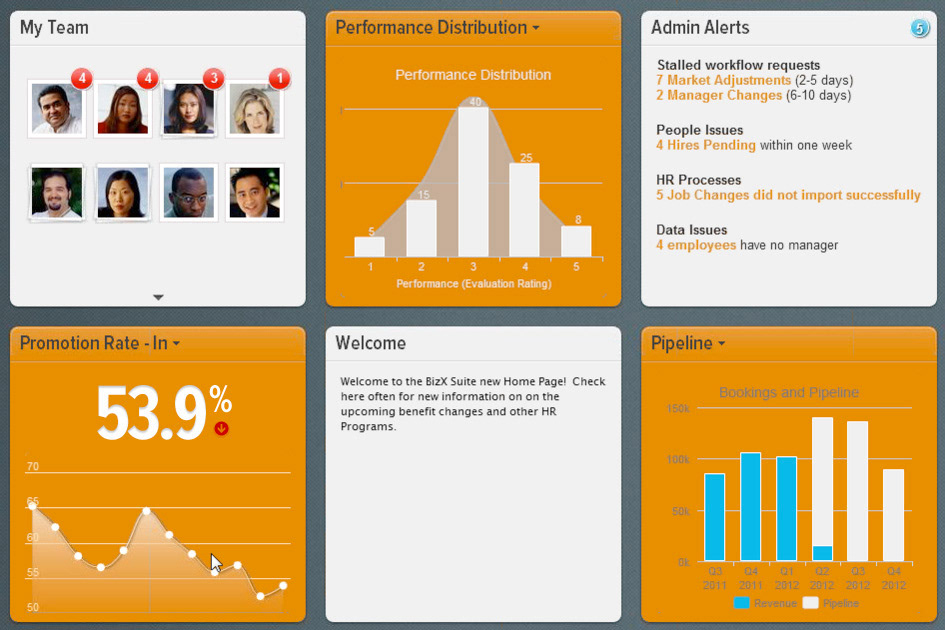
We created a more beautiful visual style to the analytic and reporting engine.
What were the results?
It generated a whole new revenue stream, by enabling a simple way to create custom, meaningful, executive level dashboards and reports.